Every business is bifurcated into two main areas: revenue generation by delivery of their products and services and creation and/or management of their products and services. Revenue generation (directly) and creation & management (indirectly) depend upon the leads generated. Organic leads are the lifeline that keeps a business afloat in a competitive market.
Your website is your face, which is live on the internet 24/7. It works on your behalf to engage visitors, share your solutions to their problems, and convert them into leads by moving them further along the process via call-to-action (CTA) buttons.
A few facts linking websites and lead generation
- Every three seconds, a website is built.
- The average reading speed of humans is 200–250 words per minute; while reading a 1200-word article, 96–120 websites would have been built.
- Top websites visited in India (2024): Google (12.1 billion), YouTube (9.18 billion), and Facebook (1.64 billion)
- The average number of leads generated by an organization is 1,877 per month
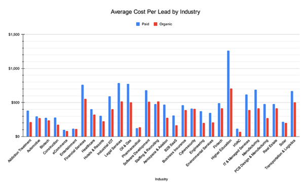
- To a select few, one lead is costing around USD 10, while some are even paying USD 1000
- The average cost per lead (CPL) is USD 198.44

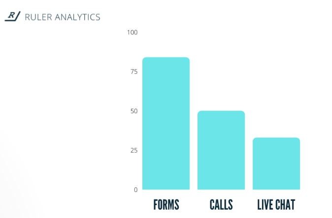
- 84% of marketers use form submissions to generate leads compared to Live chats or Cold calls.

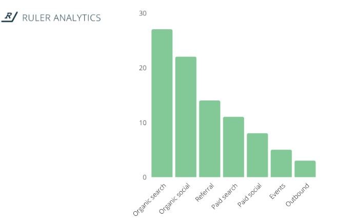
- 27% of the marketers stated that organic search generates the maximum number of leads.

This proves that your website is the gateway for the leads, and we will tell you how to optimize your gateway to encourage more organic leads.
Top 10 ways for Organic Lead Generation on a website
The below-mentioned ways are simple but sometimes miss out, which causes lead forfeiture. But with our checklist, you will not be able to miss them.
1. Use SEO for optimizing as per search engines
As shared earlier, Google is the most visited website, which means your potential viewers are looking for help on Google. It is up to your SEO practice to ensure that they find you.
With SEO, you understand the what, why, and how of the search queries and align your content accordingly. Then, these SEO keywords (as per the search queries) are sprinkled in the tile, meta description, headings, and body of the content.
Along with great content, SEO works wonders for increasing the website’s ranking by making it more visible (on the first page and in the top 5 search results). You can try keyword selection tools like Google Keyword Planner and Semrush.
2. Clear Navigation
Your website should be well organized, like a superstore such as Walmart, Reliance Fresh, and more. Because then all your offerings would be available in a clear flow and help viewers reach them.
This makes the website user-friendly and intuitive. It can be done via,
- Making sure that the navigation bar on the home page has 7 or fewer items.
- These items have simple and short labels.
- Each item in the navigation bar should have related products or services grouped together.
- Using Mega Menu, if needed!
3. CTA buttons to help in the conversion
These buttons help ensure that the viewer does not have to guess where to go or which button to click next, as they are your guests.
There are three types of Call-to-action;
- Primary CTAs -> Main convertors and appear on the landing page.
- Secondary CTAs -> Appear within the website and drive conversion by offering free stuff, i.e., a Demo, a free E-book, and more.
- Crafted CTAs-> They appear alongside the benefits of your products or services and create urgency to engage users.
You just have to make sure that the CTAs are,
- Giving clear instructions (Contact Sales, Sign Up Now, and more).
- Use contrasting colors by your brand’s theme.
- Placed strategically at the blogs’ starting and ending, services page, about us page, and more.
4. Harnessing the power of Social Media Proofs
Every positive client feedback and review is your key to unlocking more trust with the new viewers. As they prove that your brand is trustworthy and authentic!
You can use social media proof by
- Placing clients’ logos, positive reviews, and testimonials on your website.
- Using platforms like TopDevelopers.co and Clutch.co to share clients’ reviews.
- Make sure that the testimonials have details like the client’s name, title, and company name.
- Inculcating case studies that prove the effectiveness of your offerings.
5. Structured website
If your website does not have a proper structure, then it would not take the visitor more than seconds to bounce off of it.
With a proper structure, your visitors will venture further inside your website. You can achieve it by:
- Using clear & compelling headlines, shorter paragraphs, and bullet points.
- Breaking down the content into shorter forms as much as possible, either by infographics, tables, or more.
- Limiting the usage of technical or domain-related jargon as the viewer does not know that much about your industry.
- Using simple language.
6. Streamlined Contact Forms
Users do not prefer longer forms. Thus, make sure your contact forms are easy and direct. The shorter the form, the greater the number of forms filled!
You can streamline contact forms by:
- Asking only 3-5 details such as email, business position, name, requirements, and company size.
- Using clear questions.
- Allowing social media-linked signups.
- Ensure that there is a ‘thank you’ note after the submission of the form.
Also, the forms must end with clear information about the next step.
7. Using A/B testing to better your website
A/B testing is a great way to engage your viewers while getting their valuable feedback on two versions (A and B) of an item on the website. It is almost free (user feedback) and quite effective (real-time inputs from users).
It can be done via,
- Focusing on a specific element, be it a headline, a CTA, or more.
- Creating two versions (that have a slight difference).
- Using software designed for A/B testing like Crazy Egg, Freshmarketer, and more to showcase the aforementioned two versions, randomly to users.
- Tracking and thoroughly analyzing the results gathered.
- Making the appropriate changes and selecting the best possible version out of A and B.
Keep repeating the process for all the important elements of your website until it is refined and polished to perfection!
8. Speeding up the website
This is tricky because, on the one hand, you wish to create value-intensive content by adding as many videos, images, and more, but on the other hand, they make your website data-heavy!
“With just 3 seconds of loading time, the bounce rate increases by 32%!” – LinkedIn (source: https://www.linkedin.com)
You can speed up your website by,
- Optimizing videos and images to reduce their size.
- Minimizing the usage of large scripts and plugins.
- Allowing browser caching for recurring users.
- Using those content delivery networks (CDNs), can source the images from servers that are physically closest to the user.
Your website must be mobile responsive, as websites get 81% of their traffic from mobiles.
WordPress launched Speculative Loading, which allows pre-rendering of frontend URLs that are currently not visited by the user. This, according to WordPress, can ensure almost instant loading.
9. Apt Pricing
Your solutions will be judged on their features, functionalities, and, mostly, their prices.
To ensure you are transparent about your pricing models,
- Research your competitors’ pricing and offerings.
- Have pricing that is competitive and display it boldly.
- Have sample pricing with CTA buttons in the case of complex pricing models.
- Offering a free demo helps break the ice about the ease that will be introduced by your products and services.
- Have clear and concise CTAs that allow viewers to ask for quotes.
10. Show, don’t tell; have great visual appeal
Visitors like to see rather than read. So, if your narrative is built to create a great visual appeal using graphic content like images, infographics, videos, and more, then it is bound to engage viewers more!
Your website can have great visual appeal by,
- Using higher-resolution graphic content.
- Using different perspectives, their problems, and the solutions provided by your offerings to showcase your brand’s relevance.
- Breaking text monotony via graphics.
- Optimizing images ‘Alt text’ to ensure greater SEO results and increased website accessibility.
- Using visuals to augment complex descriptions.
The above 10 pointers should be strictly followed as a checklist to check the lead generation capacity of your website, as it will help in improving the same by inculcating the below Lead Magnets!
Bonus Lead Magnets for Organic Lead Generation
These lead magnets are also called conversion rate optimizers, or CROs.
| S. no. | What | How | Process | Result |
| 1 | Content Upgradation | Providing opt-in bribes in exchange for user emails | Providing cheat sheets, exclusive interviews, and more | User data for cold marketing. |
| 2 | On-site targeting | Slide-in popups | User personalized popups (new and recurring users) | The user feels more cared for and understood. |
| 3 | Anonymous users’ follow-up | Using specific tools to track visitors who did not turn into leads | Using tools like Leedy, Leadfeeder, Snitcher | User data for cold marketing. |
| 4 | Chat box | By adding a chat box on the home page and other pages. | Use tools like Tidio, Intercom to create a chat box. | Users feel that the website is live 24/7.
|
| 5 | Call Tracking | By providing such contact numbers that are assigned to particular offerings, CTAs on your website. | Using tools like Call Rail to track the source of the lead. | Sales team can reach out accordingly. |
With these lead magnets in your website arsenal, you will not miss any viewers whatsoever! If you also add paid ad redirections, more leads will find their way to you.
And your brand will have the maximum conversion ratio and establish a happy and peaceful headspace for your brand to grow, limitlessly!
We at Wildnet Technologies ensure that the brands or clients we cater to have such a website that it keeps their sales team engaged and their management happy!
We do it through the expertise and experience we have amassed over our 17-year journey in the IT and digital marketing domains. We have expert content creators, designers, SEO personnel, PPC ad personnel, and Programmatic ad personnel.
Like to read more?
- White label services’ cost effectiveness for your agency
- Website’s design impact on your brand’s online presence
- Devin and Devika: AI software engineers
Reach out to us at info@wildnettechnologies.com and witness the bountiful rains of leads!


